Project Overview
Engaged in a creative exploration for the Liquicity brand, this project involved designing two distinct header concepts for the website, one dark and one light. This work was experimental, aimed at exploring visual aesthetics and their impact on user experience and brand perception.
Design Goals: Evaluate the effectiveness of different color schemes within web interfaces and determine which style best suits the Liquicity brand.
Audience Engagement: Engage viewers by presenting both versions and soliciting feedback on preferences.
Design Challenges
The challenge was to create two contrasting versions of the same header design that both align with Liquicity’s brand identity while showcasing distinct atmospheres and user experiences.
Design Strategy and Implementation
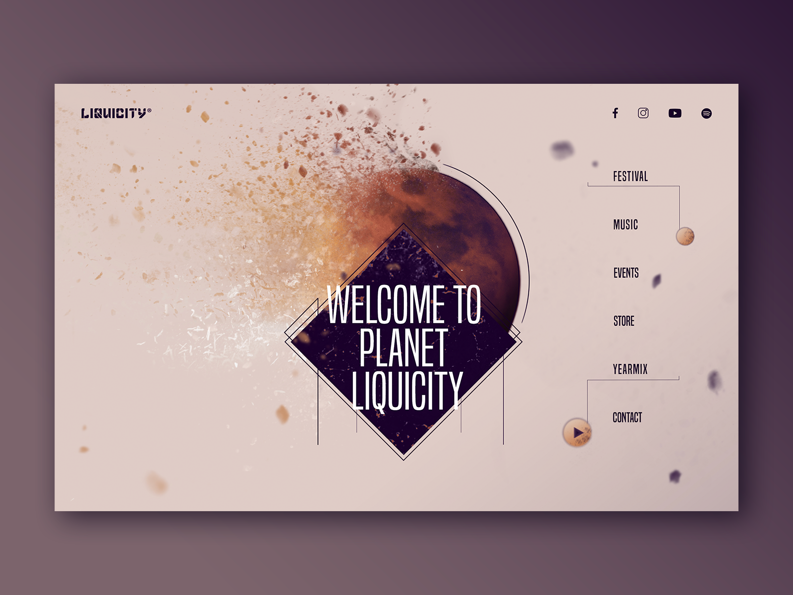
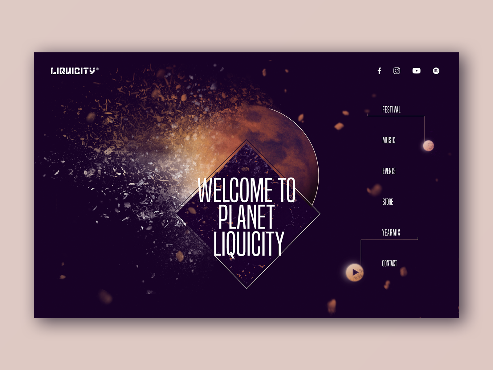
Dark Version: Focused on a sleek, sophisticated look that enhances visual elements through contrast, ideal for highlighting vibrant graphics and content in a more subdued, professional manner.
Light Version: Emphasized a clean, inviting atmosphere that uses lighter tones to create a sense of openness and clarity, enhancing readability and a friendly user interface.
Feedback Mechanism: Incorporated a simple feedback tool to gather user preferences directly on the design page, providing valuable insights into user tendencies and preferences.
Tools and Technologies: Utilized Adobe Photoshop and Sketch for designing both versions, allowing for quick iterations and easy toggling between themes.
Project Impact
This conceptual exploration not only showcased creative versatility in web design but also engaged the Liquicity community by involving them in the design process. Collecting feedback on the dark and light themes provided insights into audience preferences, aiding in future design decisions that align with user expectations.